Understanding the user
User research
Persona
Problem Statement
.png)
User journey
map
.png)

.png)
.png)
.png)

I coined the slogan in line with the needs of the users. The persona reflected that the user wanted to spend wisely by tracking and controlling their spending. The slogan and tagline echo that needs. The copy is simple, friendly and straight to the point; no wordiness.
The Signup and login buttons are clear, concise and useful, in accordance with the best practices of UX writing. The wallet, money and notepad represent what the app is about. Since we used a content-first approach, the content and illustration are in perfect sync.
The content on the Sign Up page is clear, concise and useful in accordance with UX writing’s best practices. The tone has become more friendly and enthusiastic here as we’re encouraging the user to sign up. This is essential as bounce rates are high at this stage.
Making the user more comfortable on this page helps reduce the bounce rate. This will only take 10 seconds,” also helps calm the user down and assure them that the exercise won’t take too much of their precious time. The caveat below is an assurance that the user’s data is safe. This is also camping and assuring.


This page shows the user has successfully signed up on the app. The content is warm and exciting to suit the user’s mood.
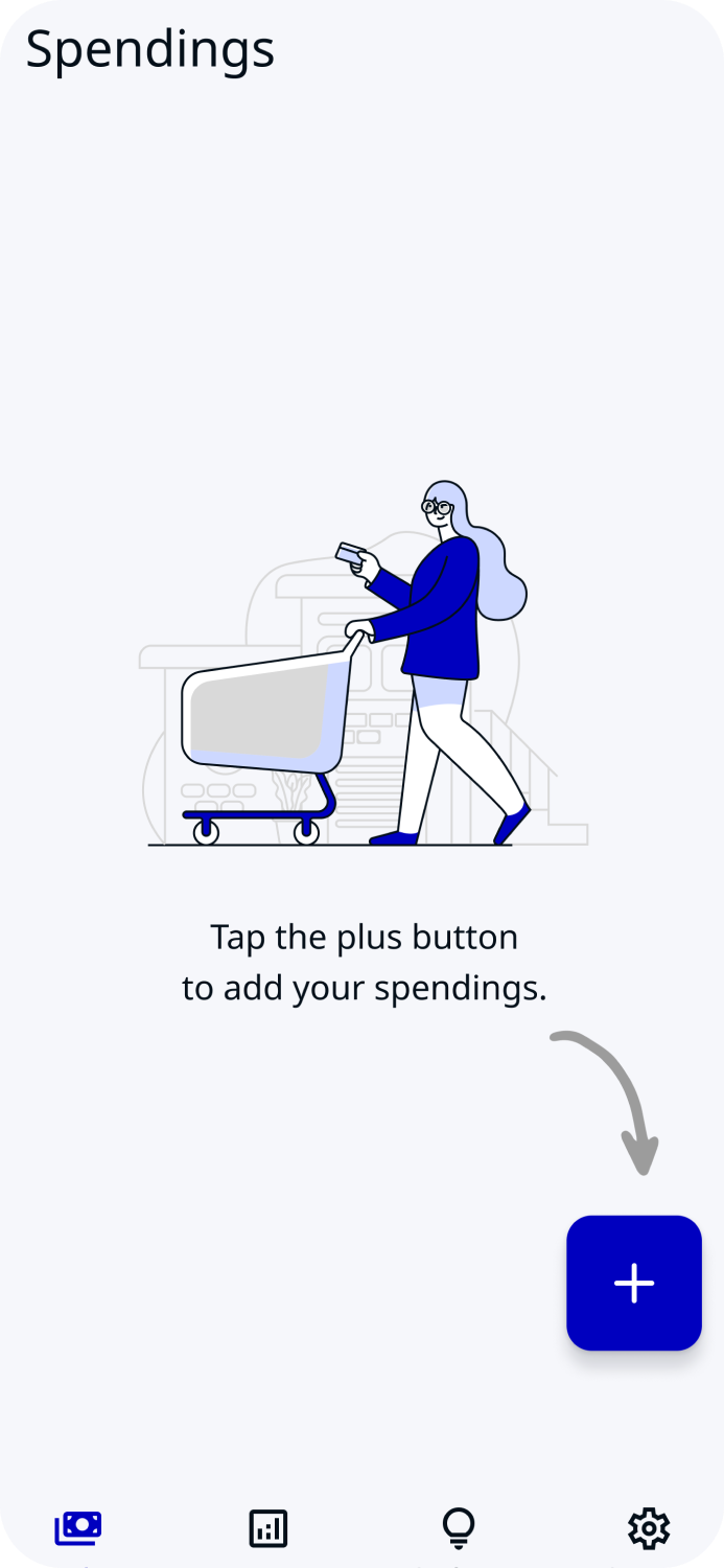
The user has signed up and has been redirected to the spending recording page where they can start recording their spending for the day.“It’s a new day! Start it right.” is enthusiastic, friendly and encouraging in line with the brand voice.
We’re encouraging the user to start a healthy spending habit so our tone has to portray that mission. Note that there’s no wordiness on the page according to our user’s pain points during the research stage. The abundant whitespace makes it easy for the user to concentrate on the main messages.


These are empty and filled report pages. They all have copies that are clear, straightforward and concise. Note the sufficient whitespace in the first one.